Notaires Condrieu
Creation of the visual identity and website
Client
Notaires Condrieu
Context
Notaires Condrieu is a notary office located near Lyon. As part of its reorganization, the management asked me to create a new visual identity as well as its website.
Project
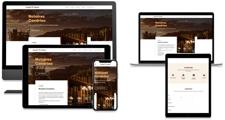
Creation of the visual identity and website.
Condrieu is a town known for being a wine-producing region, so the client asked me to create a visual identity and a website that remind a little this world.
The logo created for Notaires Condrieu is composed of two parts:
At the moment, a landing page is online, awaiting client approval to put the final website online.
Condrieu is a town known for being a wine-producing region, so the client asked me to create a visual identity and a website that remind a little this world.
The logo created for Notaires Condrieu is composed of two parts:
- a logotype symbolizing a bunch of grapes, which reminds that Condrieu is located near vineyards:
- in alchemy, the reverse triangle symbolizes water, which influences the history of vineyards and wine.
- generally speaking, water is an essential element in human life (our bodies are 60% water!) and asking for notary’s help also means being guided in various life projects.
- a wordmark logo which uses the name of the notary office, written in bold sans-serif font, to bring modernity and strength to the logo.
At the moment, a landing page is online, awaiting client approval to put the final website online.
My role in the project
UI Designer • Web Designer • Front-end web developer
My missions
- creating the visual identity (logo, color palette, typography, corporate identity and style guide)
- defining the user journey
- building sitemap
- creating user interfaces for web and mobile (wireframes, mock-ups, prototypes), on the basis of the brand identity created for the notary office
- coding via WordPress
- updating the website